projects.app - star.host.program

Star Host Program

FriendZone's host ranking was invisible. Hosts had no idea why some earned more than others. I designed a system to make that ranking transparent, actionable, and motivating for a non-tech-savvy audience.

Role
UX/UI Designer
Industry
Entertainment
Platform
iOS & Android
Year
2024
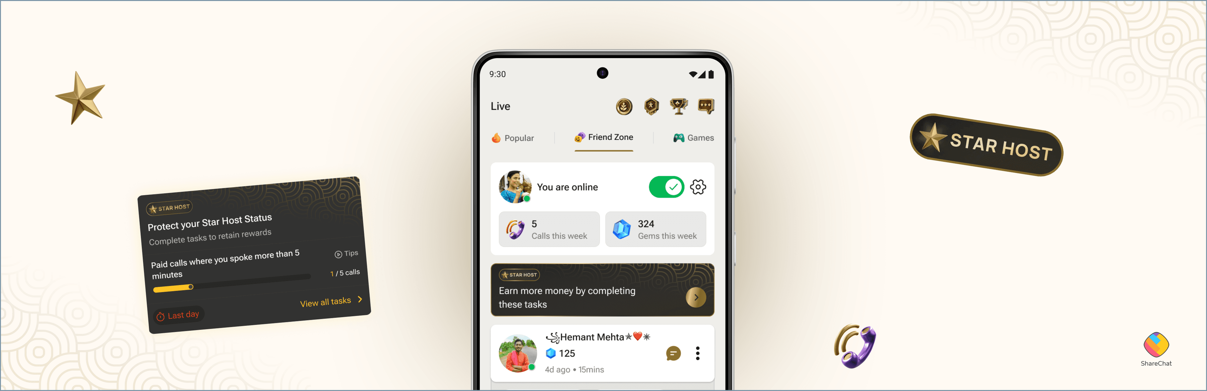
Star Host Program hero mockup

// PROBLEM STATEMENT

Invisible rules. Real lost income.

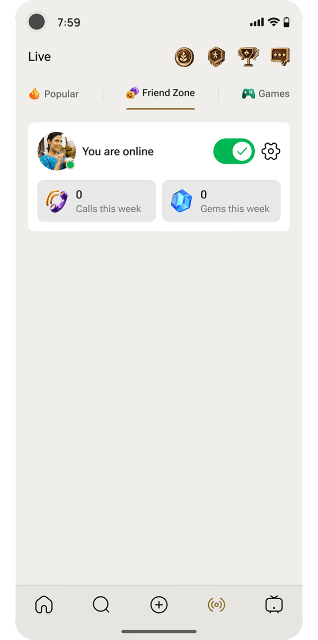
FriendZone hosts are ranked based on call pickup rate and time spent on calls but this ranking system operates entirely behind the scenes. It directly determines where they appear on the feed and how many calls they receive.

Most hosts come from Tier 2 and Tier 3 cities – many homemakers and college students relying on this platform for income. This invisibility meant losing earning opportunities without ever knowing why.
// OBJECTIVE

Pull back the curtain. Give hosts a path forward.

Design a feature that pulls back the curtain on the ranking system and gives hosts a clear, motivated path to improve their standing — without requiring technical know-how to navigate it.

"Where do I stand?"

"What do I do next?"

// USER COHORT

Designing for someone's first smartphone.

FriendZone's hosts are predominantly women from Tier 2 and Tier 3 cities — homemakers and students seeking flexible, accessible income. Digital literacy varies widely across this group, making simplicity and intuitive design non-negotiable.

Every design decision was filtered through one question: would someone using a smartphone for the first time understand this?

// FLOW CHART

Three states. Three different needs.

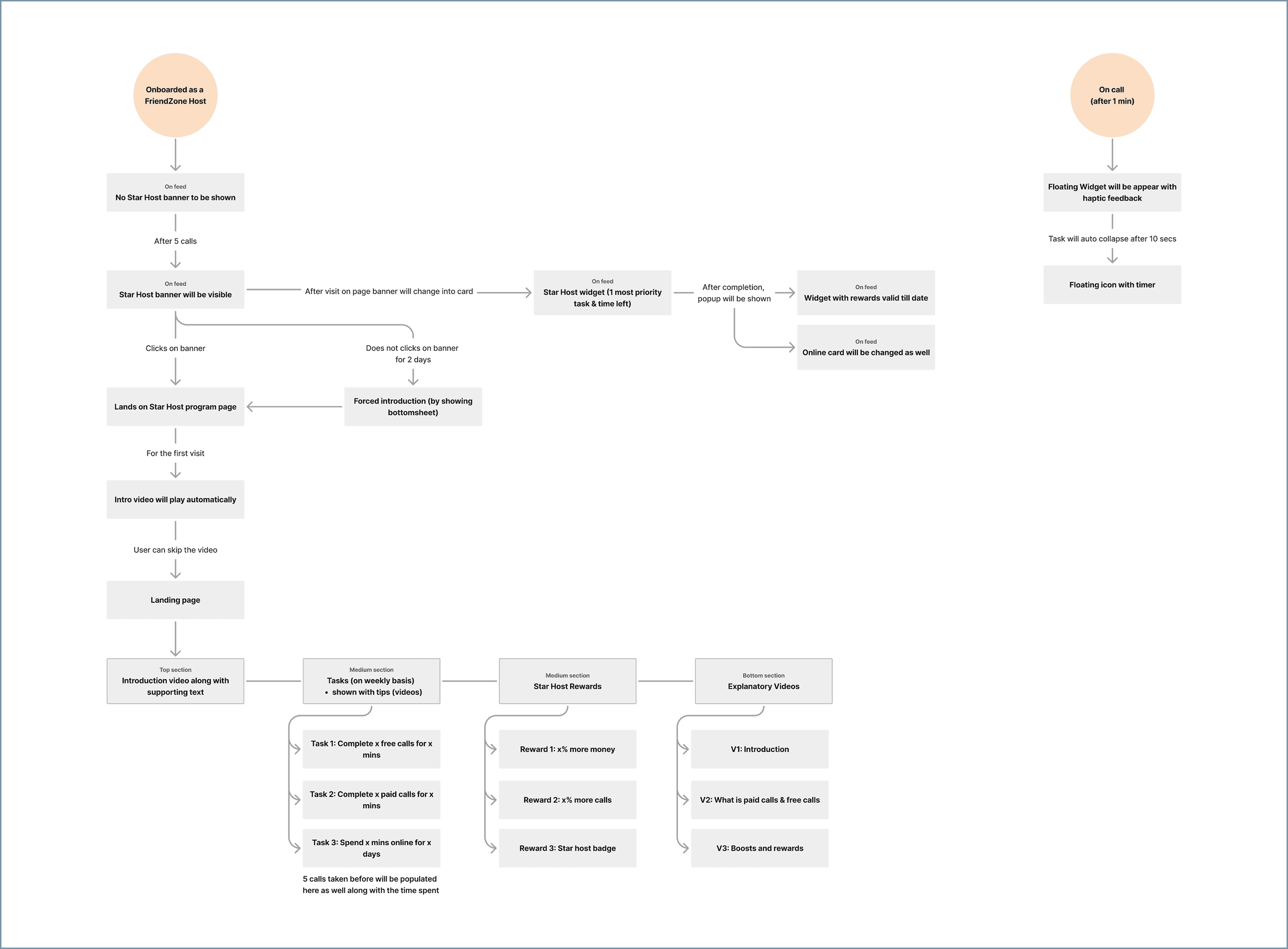
The flow was designed around three key user states — each needed a different entry point, level of guidance and set of nudges to keep the experience from feeling overwhelming at any stage.

Stage 1

First-time host

Hasn't yet engaged with the program. Needs footing before framing.

Stage 2

Active host

Working through tasks. Needs visible progress and clear next steps.

Stage 3

Returning host

Maintaining Star Host status. Needs reinforcement, not re-explanation.

Three-state host journey flow chart

// D0 · HOST JOURNEY ON FEED

Introduced only when they're ready for it.

1st time login

Intentionally free of Star Host messaging. New hosts need to find their footing first — how calls work, what gems are, how earnings are calculated. The Star Host banner is deliberately hidden at this stage.

First-time login screen, free of Star Host messaging

Host feed after 5 calls

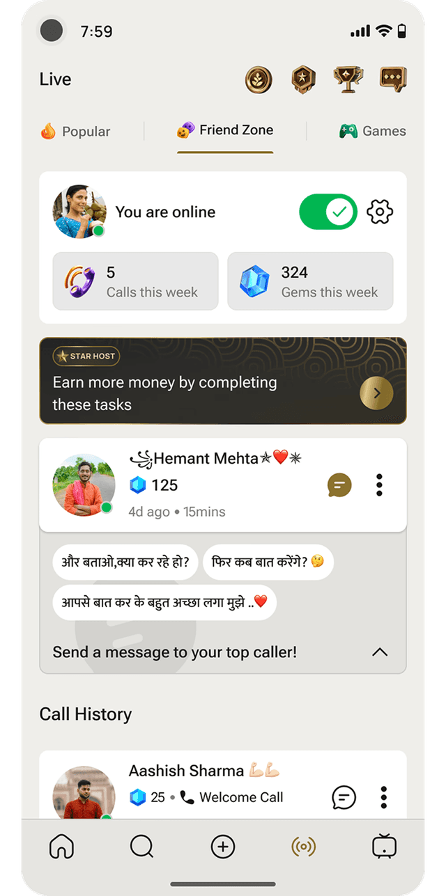
Once a host has built enough platform familiarity, the Star Host widget appears on the first fold of their feed – visible and prominent, introduced only when ready.

Host feed with the Star Host widget after 5 calls

Forced introduction

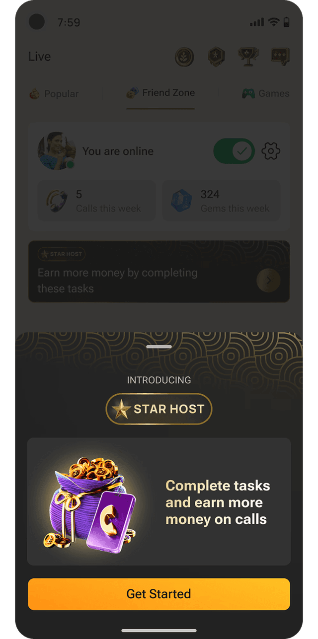
If a host doesn't engage within 2 days, a bottom sheet gives a direct introduction the next time they land on the feed — shown only once, enough for awareness without feeling pushy.

Forced introduction bottom sheet

// HOST LANDS ON THE STAR HOST PAGE

Feels like a coach. Not a dashboard.

Intro video

First-time visitors are greeted with a short tutorial — what the program is, how it works, what's in it for them. Skippable, but always accessible from the page header for a refresher.

Star Host page intro video

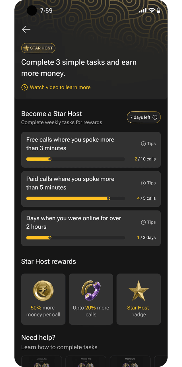
Landing page

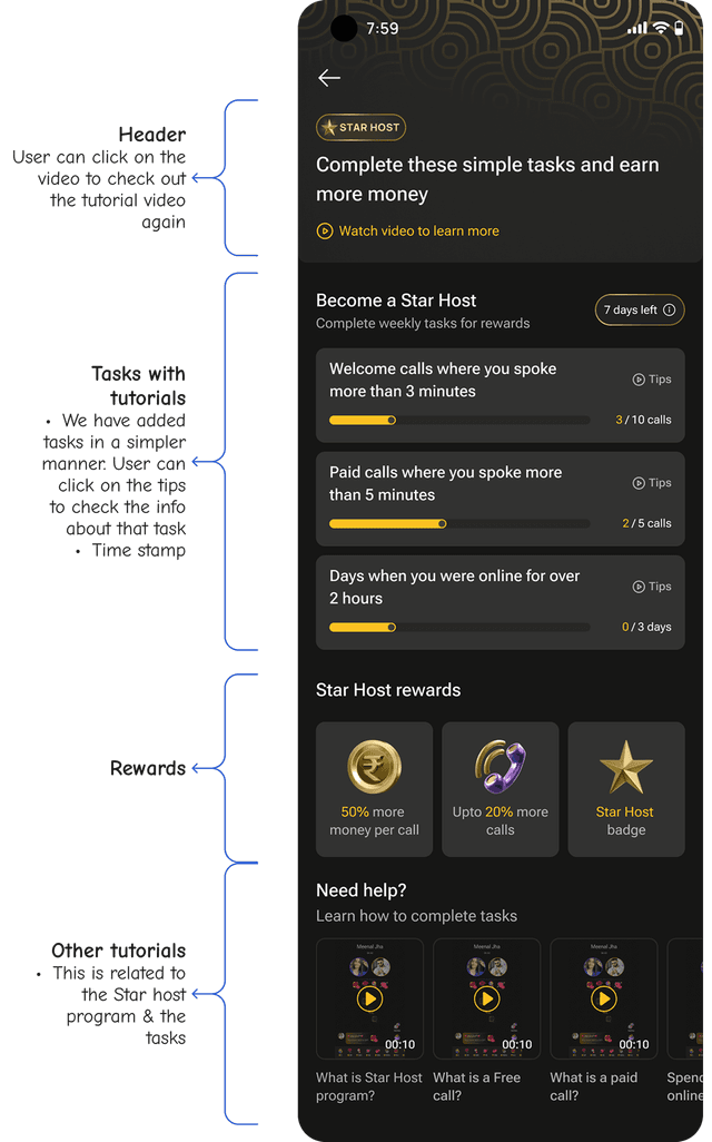
Everything at a glance: current standing, all active tasks with contextual tips, and the rewards waiting on the other side. No buried information, no confusing hierarchy.

Star Host landing page with tasks, tutorials, and rewards

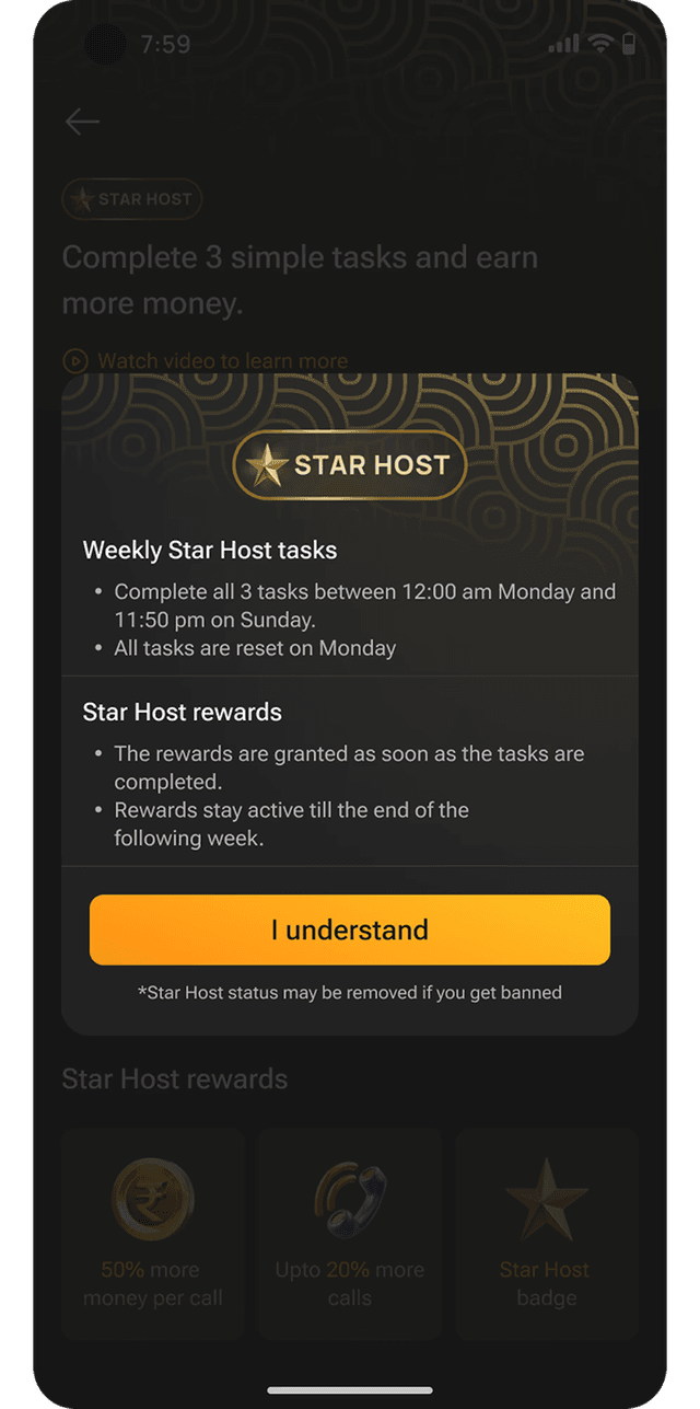
Task rules

Tapping the remaining time reveals what counts, what doesn't, and exactly what qualifies — kept a layer below the main view to avoid overwhelming hosts upfront.

Task rules bottom sheet

// TRANSITION OF THE STAR HOST PAGE

Abstract tasks become a measurable journey.

After some calls

Data begins populating on the page in real time. Progress becomes visible and tangible — the more a host does, the more the page comes to life.

Star Host page with progress populating after some calls

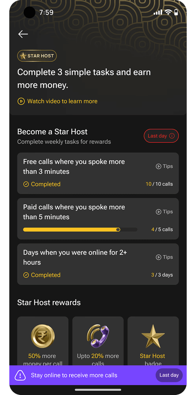
Less time left

A sticky strip appears at the bottom as the deadline approaches — persistent enough to be noticed, unobtrusive enough not to disrupt the experience.

Sticky strip showing less time left
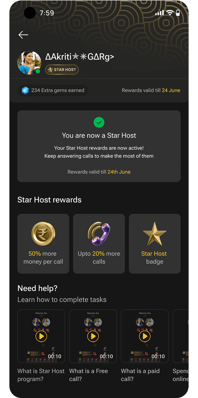
Star Host badge

Became Star Host

Once all tasks are complete, the page transitions to a confirmation state — a clear, satisfying moment of achievement that makes the effort feel worth it.

Became-Star-Host confirmation screen

// STATUS EARNED - POPUP, FEED & NUDGES

Recognition, expectation and consistency.

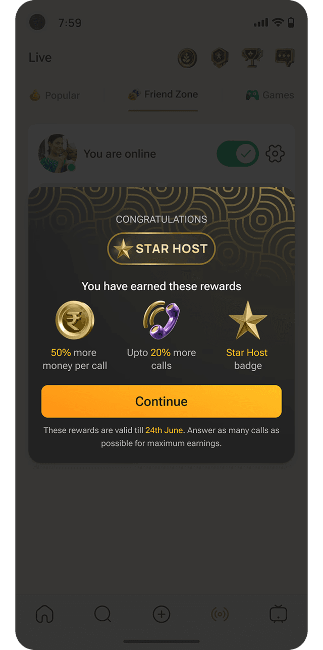
Congratulations popup + badge

A popup confirms achievement and the new slab unlocked — the first thing a host sees. The Star Host badge now also shows with their profile picture.

Star Host congratulations popup

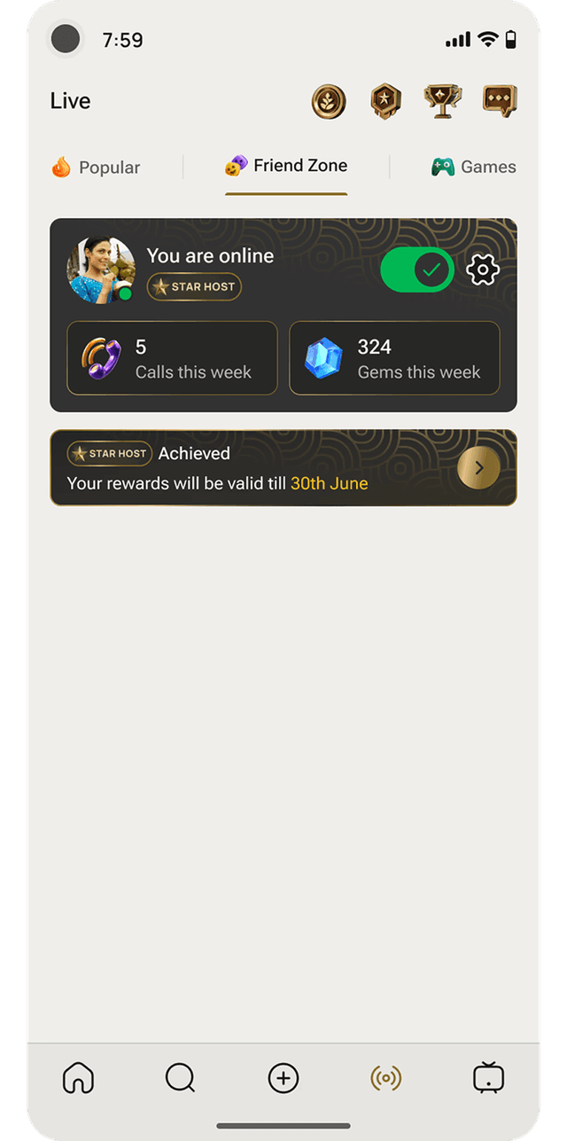
Star Host is Achieved

The feed shows the follow-up banner clearly communicating when the host's benefits will become active. Rather than leaving hosts wondering, this screen sets the right expectations.

Also, now the Star Host badge will be shown with the Host's Profile Picture.

Feed showing the Star Host achieved banner and profile badge

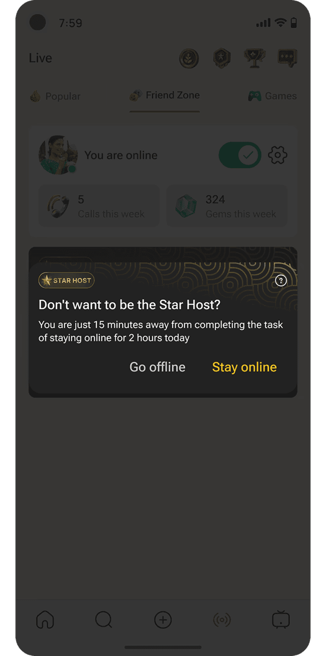
Going offline nudge

When a host tries to go offline, a prompt shows how much time remains on their daily "stay online" task — surfaced at exactly the moment they're most likely to step away.

Going-offline nudge prompt

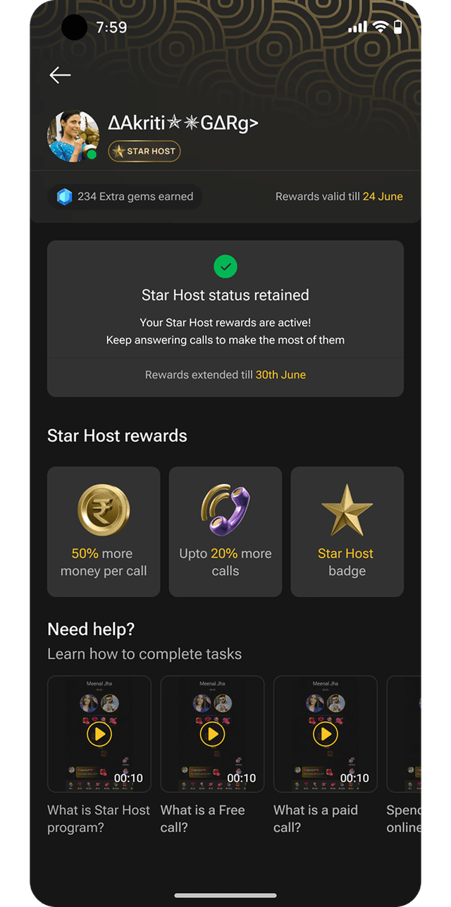
Retained status, next week

Completing the new week's tasks triggers a "retained" confirmation — rewarding consistency, not just first-time achievement, building the habit loop that keeps hosts engaged.

Retained-status confirmation screen

// ITERATIONS

Three tiers became one. Clarity beat complexity.

VERSION 1

GOLD, SILVER, BRONZE

A three-tier system rewarding varying performance levels. Testing revealed it created confusion, not motivation — hosts weren't sure which tier to aim for or what differentiated them.

SHIPPED

STAR HOST

Stripped back to a single status. One clear goal, one clear reward. The simplification didn't reduce motivation — it sharpened it.

// WHY DARK MODE?

Light mode made it disappear.

Early designs used light mode, but Star Host elements kept blending into the surrounding UI — losing the visual weight the program needed. Dark mode gave the feature immediate distinction: hierarchy became easier to read, and the tone matched the program's aspirational feel.

// OUTCOMES

Strong adoption. Measurable impact.

20%

Organic growth in hosts achieving Star status — genuine behavior change, not just awareness.

>50%

Daily program page adoption — well beyond expectations for a non-tech-savvy audience.

+15%

Increase in free call time — directly reversing prior avoidance behavior.

64%

Of total GMV contributed by Star Hosts — 8-9 points above initial projections.

That's a wrap.

The Star Host Program is live on FriendZone today, turning an invisible ranking system into something hosts understand, trust, and are motivated to chase.


Other Case Studies


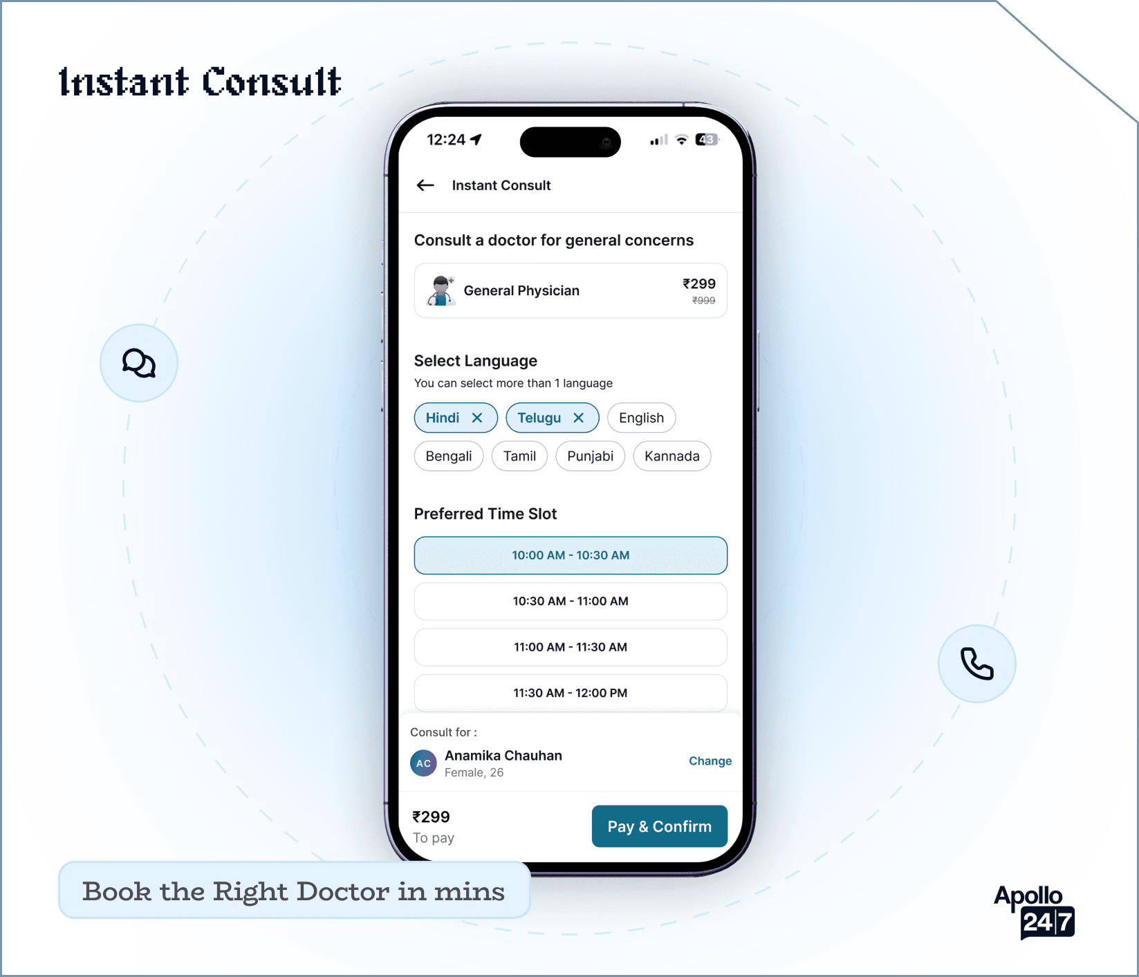
Instant Consult mockup

Instant Consult

A high-priority feature designed to facilitate rapid, on-demand medical consultations, connecting users with healthcare professionals instantly when time is of the essence.

View
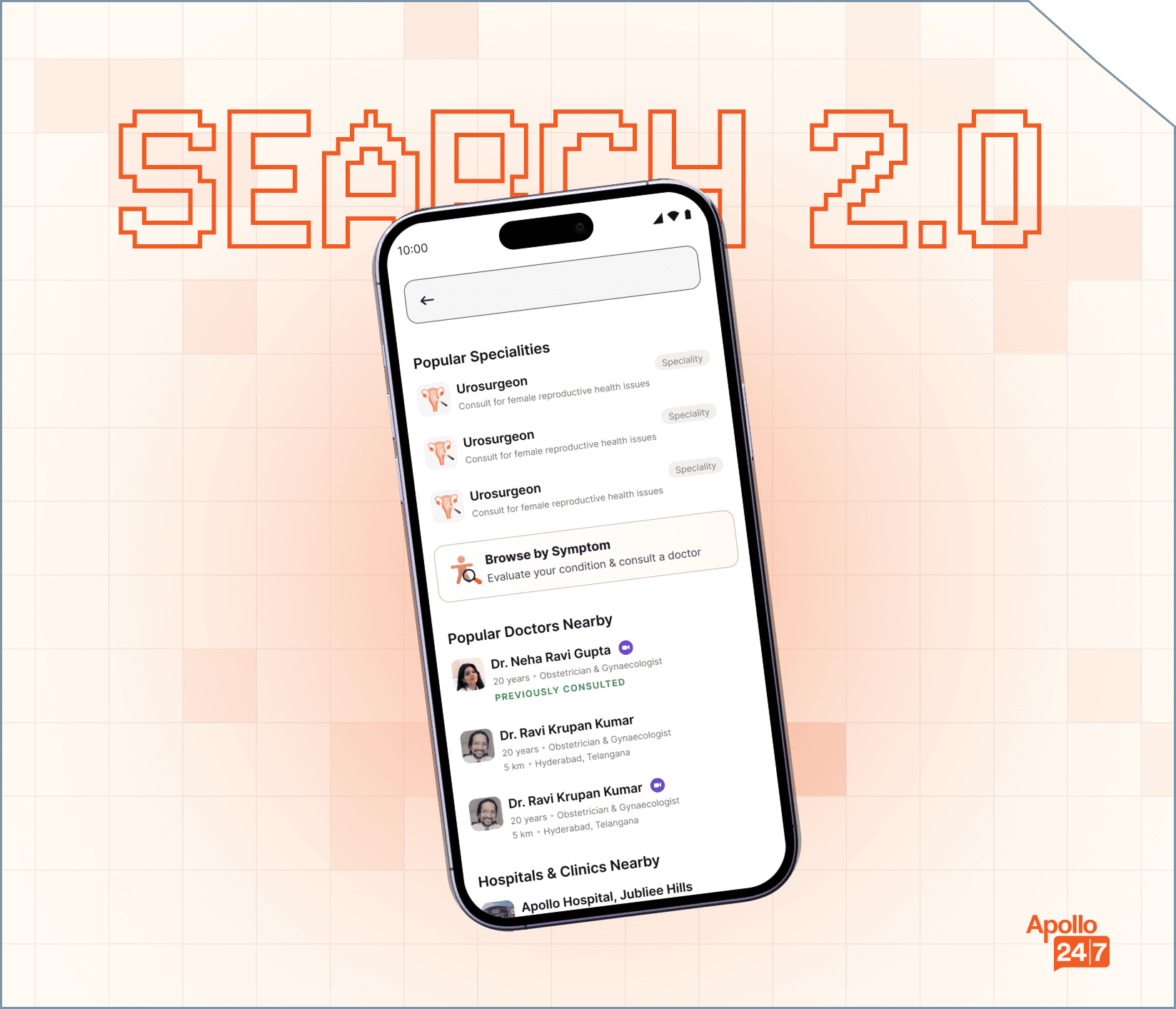
Search Revamp mockup

Search Revamp

A comprehensive redesign of the core search experience to improve discoverability, relevancy, and user decision-making for a major healthcare platform.

View